
|
|||||||


Tampa Bay Bucs New Logo
this is a discussion within the NFL Community Forum; I don't like the numbers. Too much like an old fashioned digital alarm clock. I do like that they got a little orange cream cycle in there....
 15Likes
 |
|
|
|
LinkBack | Thread Tools | Display Modes |
 03-03-2014, 11:41 PM
|
#41 |
|
Site Donor 2019
Join Date: Jan 2012
Location: Salt Lake City, Utah
Posts: 3,521
|
Re: Tampa Bay Bucs New Logo
I don't like the numbers. Too much like an old fashioned digital alarm clock.
I do like that they got a little orange cream cycle in there. |

|

|
03-04-2014, 09:11 AM
|
#42 |
|
Resident Swede
Join Date: Sep 2005
Location: Märsta, Sweden
Posts: 8,065
|
Re: Tampa Bay Bucs New Logo
That new uniform is a complete disgrace.
|
|
|
|
03-04-2014, 09:24 AM
|
#43 |
|
The Owner
Join Date: Mar 2006
Location: New Orleans, LA (10/1/13)
Posts: 791
|
Re: Tampa Bay Bucs New Logo
Originally Posted by exile


|
|
|

|
03-04-2014, 09:54 AM
|
#44 |
|
The Owner
Join Date: Mar 2006
Location: New Orleans, LA (10/1/13)
Posts: 791
|
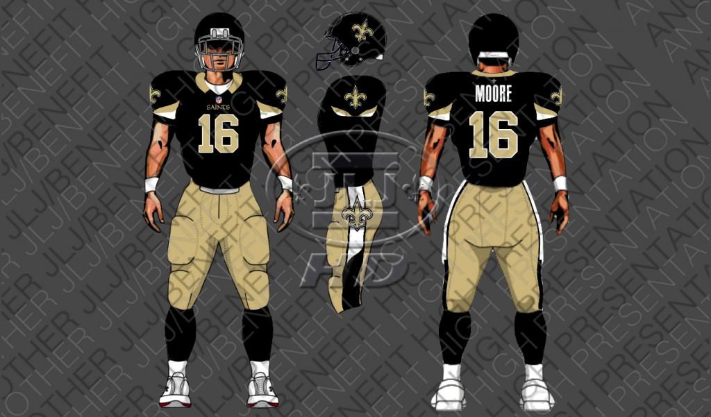
Re: Tampa Bay Bucs New Logo
Originally Posted by TheOak
I prefer these....
|
|
|

|
03-04-2014, 06:49 PM
|
#45 |
|
5000 POSTS! +
Join Date: Feb 2007
Location: Atlanta
Posts: 6,324
|
Re: Tampa Bay Bucs New Logo
Originally Posted by 9thWardDesire
Lance Moore is white and has a 22 inch waist?
|
|
|
|
03-08-2014, 08:46 AM
|
#46 |
|
Site Donor
Join Date: Sep 2010
Location: in line with my ridiculous CLEAR PLASTIC BAG
Posts: 3,650
Blog Entries: 3
|
Re: Tampa Bay Bucs New Logo
It will be interesting to see if those '80s calculator numbers are hard to read from the tops of the stadium or from very far away. They look to me like they could be difficult to figure them out, while a player was moving or twisting or something, if you're way up top in the stands. But I doubt they even thought of that, just trying to be cute.
|
|
|
|
«
Chiefs Free Agent Watch 2014: Is Lance Moore the Chiefs New #2 Wide Receiver
|
Cowboys may release Ware.
»
 Linear Mode

|
|

 LinkBacks (?)
LinkBack to this Thread: https://blackandgold.com/nfl/64382-tampa-bay-bucs-new-logo.html
|
||||
| Posted By | For | Type | Date | Hits |
| Warren Sapp tweet | This thread | Refback | 02-19-2014 04:46 PM | 27 |
| Tampa Bay Bucs New Logo | This thread | Refback | 02-18-2014 09:54 AM | 38 |
All times are GMT -5. The time now is 07:56 AM.

